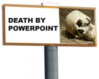
 Powerpoint slides are “glance media” just like billboards. Today’s post by Garr Reynolds at Presentation Zen is an excellent synopsis of how billboards can inform slide design.
His post builds on Nancy Duarte’s Slide:ology where she sets the standard for glance media – “Ask yourself whether your message can be processed effectively within three seconds.”
In a marginally related segue I’ve been reading Daniel Gilbert’s “Stumbling on Happiness”. Today’s best insight:
“My friends tell me that I have a tendency to point out problems without offering solutions, but they never tell me what I should do about it.”
In this spirit Garr provides 8 tips for how to put the billboard insights into practice with your slides.
1. Make it visual – “vision trumps all other senses”
2. One slide, one idea
3. Make type big
4. Contrast rules
5. Don’t be afraid of bleed[ing off the page]
6. Rule of Thirds
7. Empty space
8. Have a visual theme
Whether you are in sales, marketing, raising money, or making an internal pitch your presentation can benefit enormously from following these guidelines. You will increase the odds of communicating the message you intend to share (“we need to buy that thing”) vs. the message that you actually communicate (“this guy is confusing me”).
I love his mock up of a billboard as designed by the average Powerpoint user – its funny and informative.
The world would be a better place if people applied these rules to their slide decks. All too often they do exactly the opposite – ugh.
 The Education Business Blog

